Study O Portable’s Neon Alphabet is what you think it is
Objects of Reflection
-

Neon Alphabet
Courtesy of Study O Portable
-

Neon Alphabet
Courtesy of Study O Portable
-

Neon Alphabet
Courtesy of Study O Portable
-

Neon Alphabet
Courtesy of Study O Portable
-

Neon Alphabet
Courtesy of Study O Portable
-

ABC Necklace
<em>Courtesy of Study O Portable</em>
-

ABC Necklace
<em>Courtesy of Study O Portable</em>
-

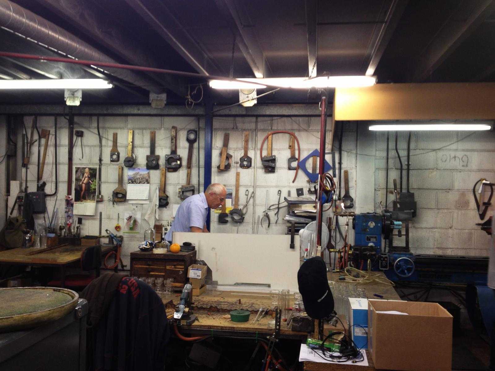
Neon Alphabet in production
Courtesy of Study O Portable
-

Neon Alphabet in production
Courtesy of Study O Portable
-

Neon Alphabet in production
Courtesy of Study O Portable
-

Neon Alphabet in production
Courtesy of Study O Portable
-

Tetsuo Mukai and Bernadette Deddens of Study O Portable
Courtesy of Study O Portable
-

Neon Alphabet
Courtesy of Study O Portable
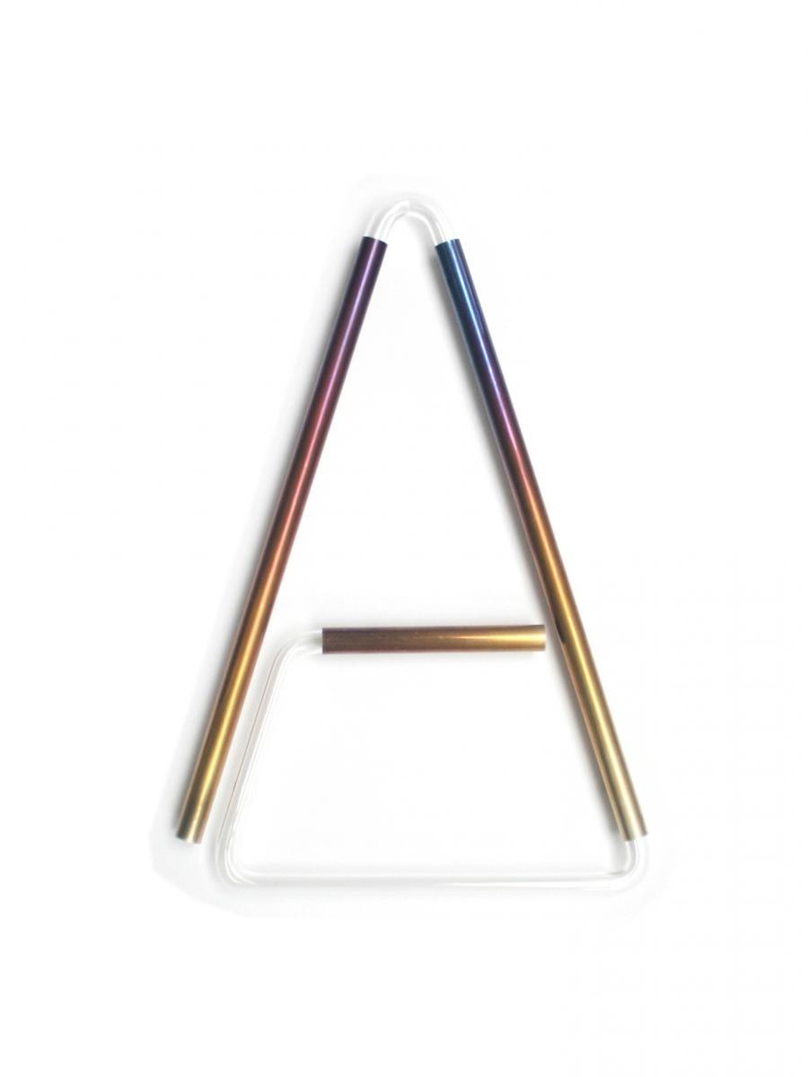
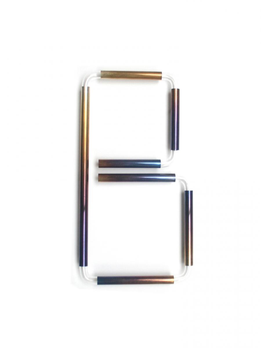
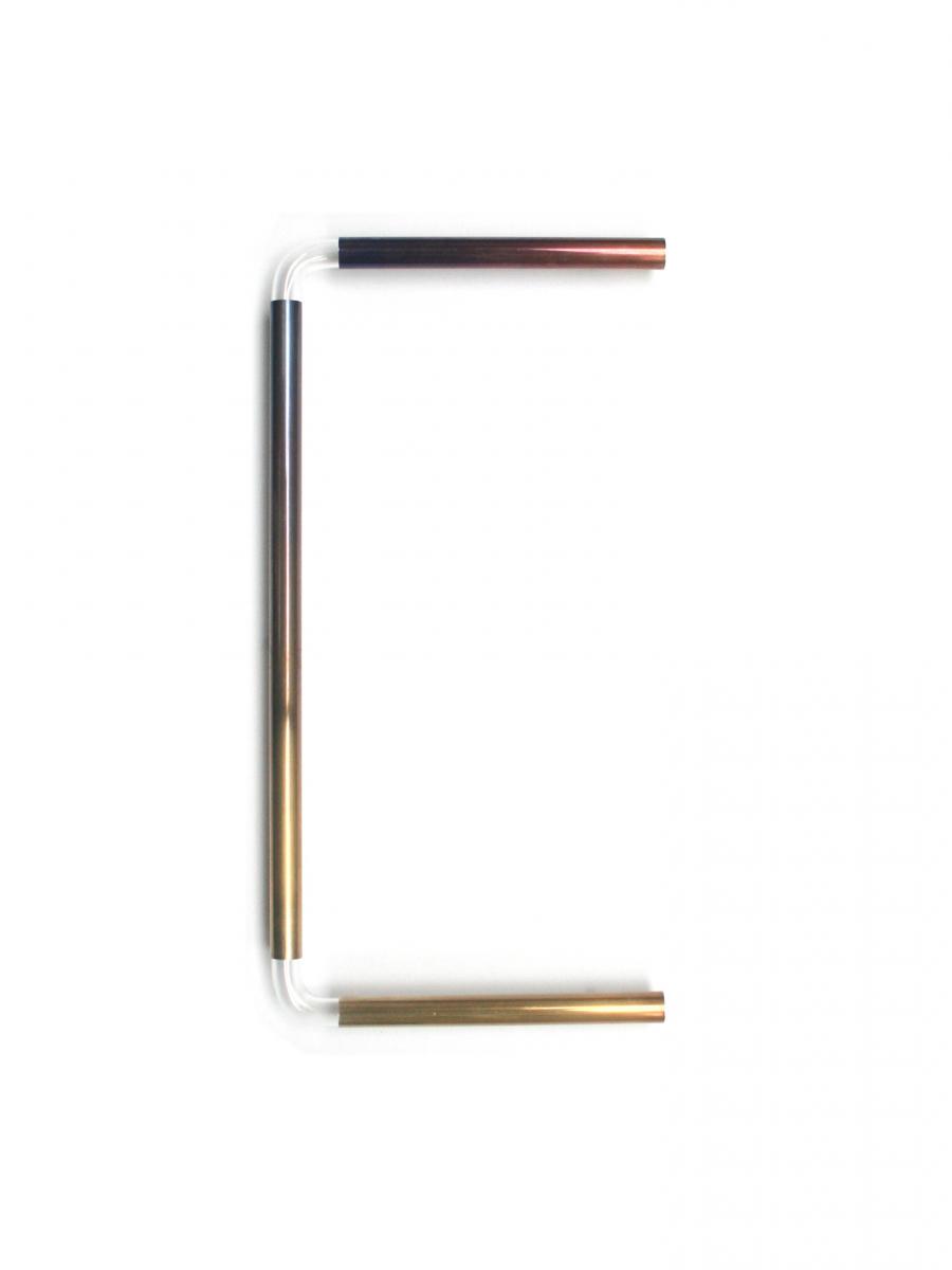
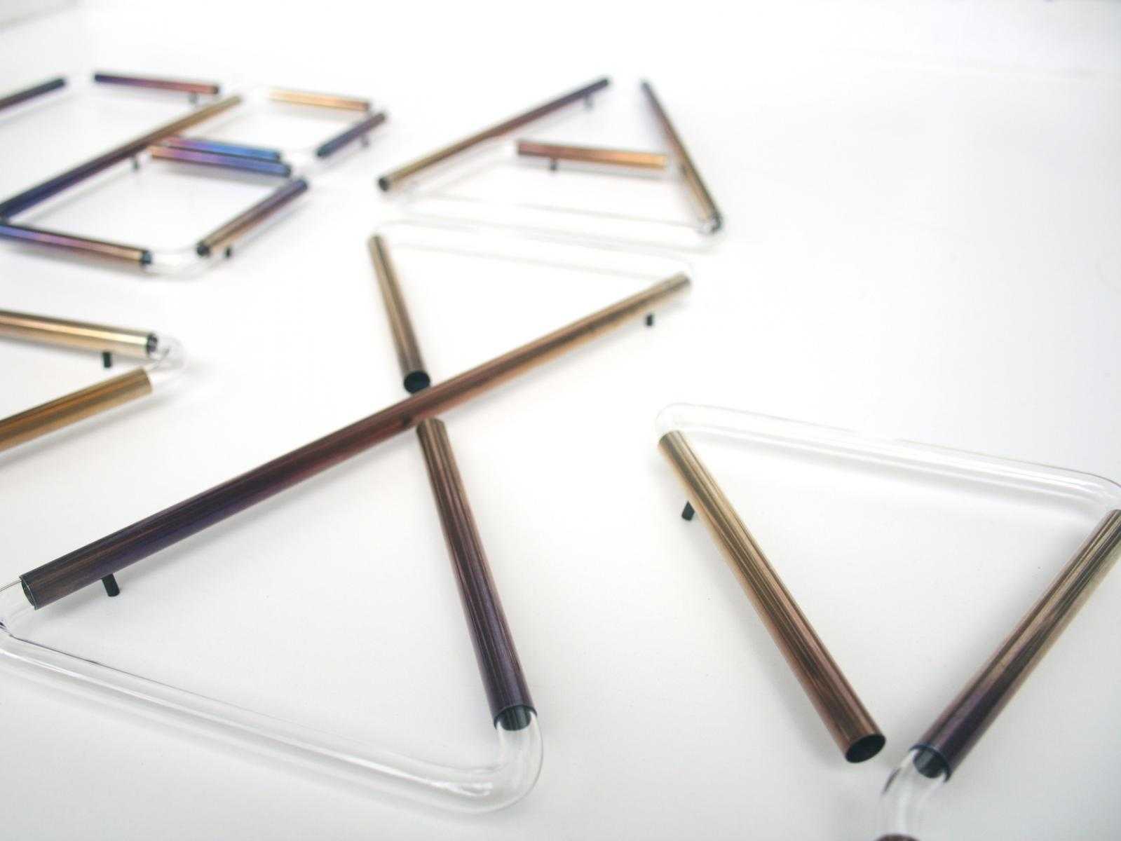
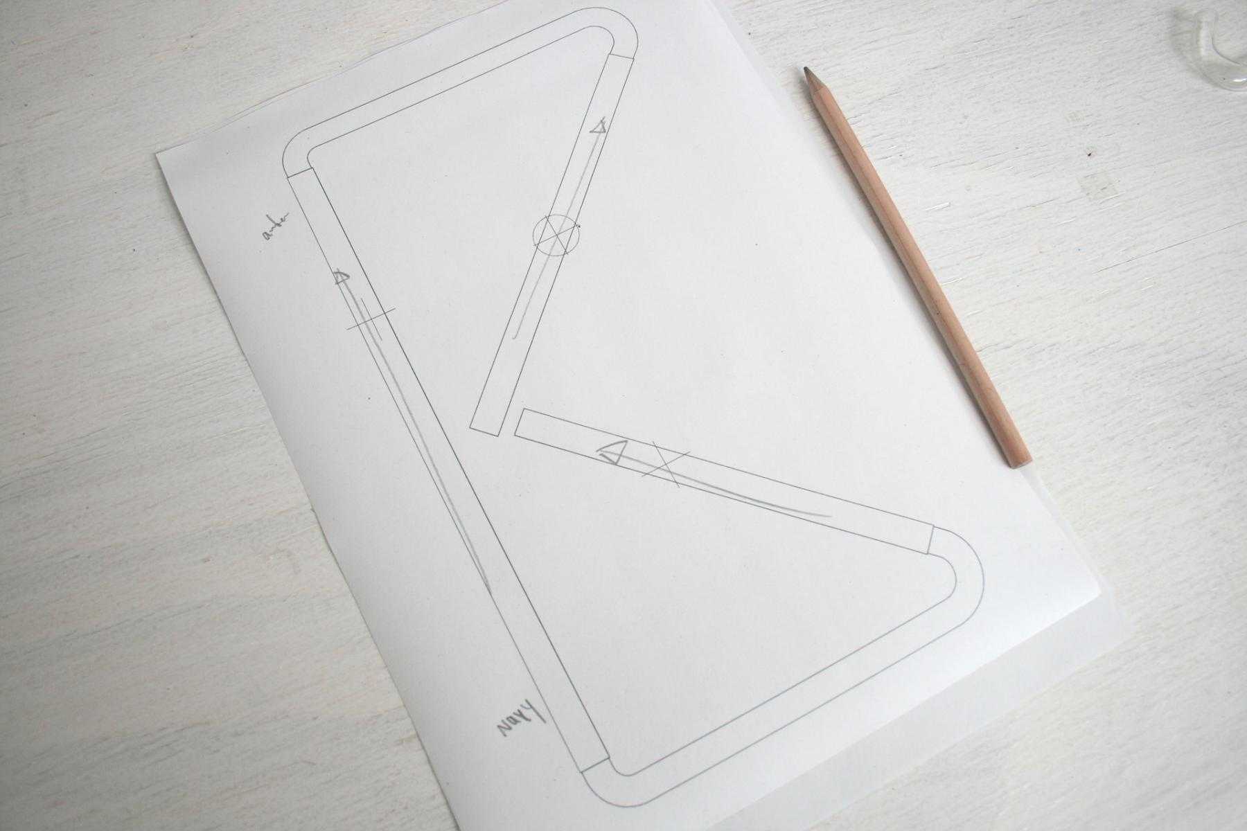


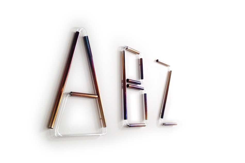
Tetsuo Mukai and Bernadette Deddens of Study O Portable are clear about what they want to achieve in their work: “The kind of designers we like are those who make us reflect on the manmade world, who communicate ideas in the form of objects. This is what we aspire to do in our own designs.” Their Neon Alphabet, designed in 2012 and represented by Caroline van Hoek gallery, realizes this object-as-communication aspiration quite literally.
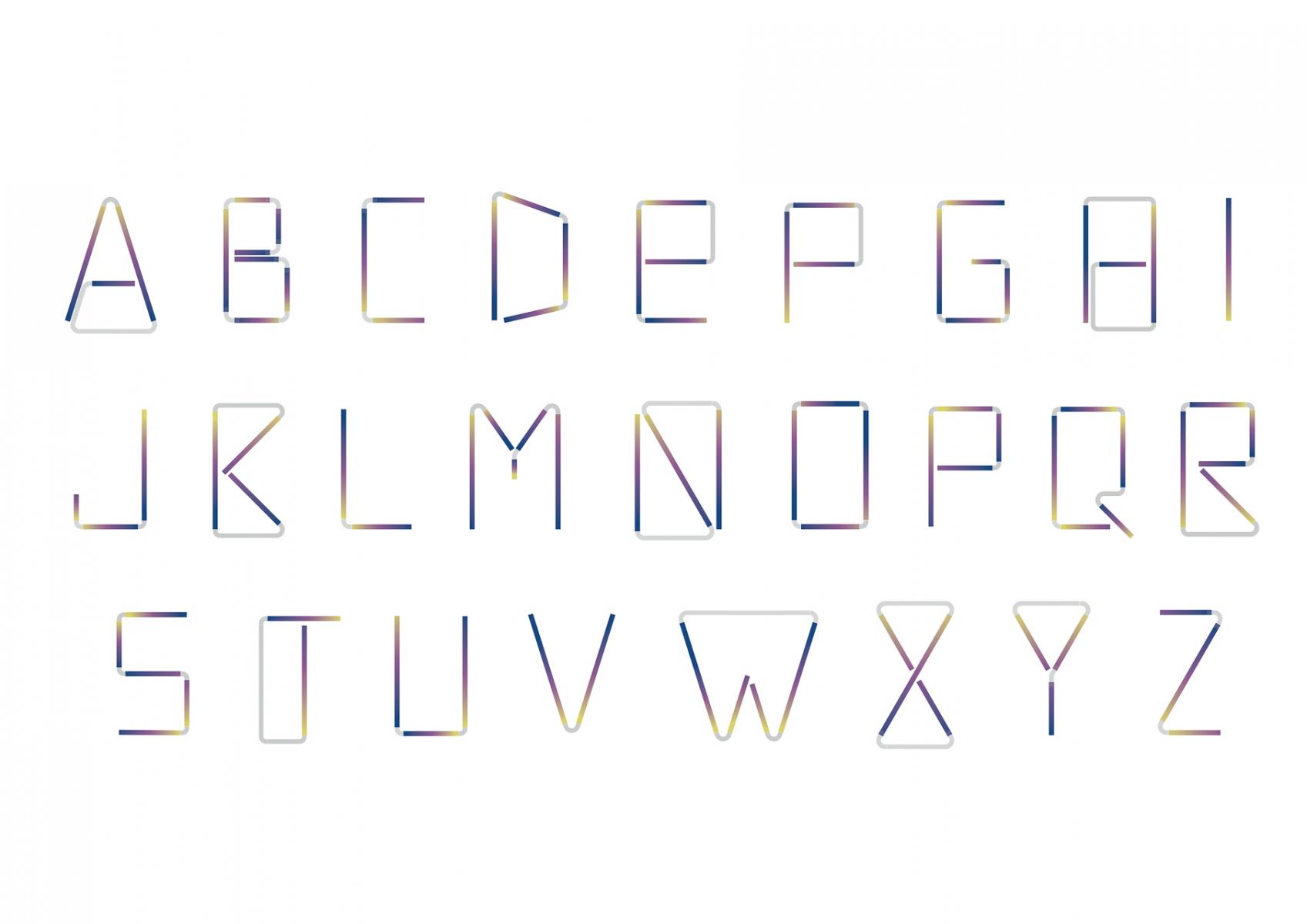
Comprising the 26 letters of the Roman alphabet – each about 25cm high, 18cm wide – Neon Alphabet is hard to classify in terms of function. It’s a bit like jewelry for your walls; or a three-dimensional font; or, as the name implies, a simulacrum of neon signage. Each letter (and grouping of letters) is made to order, so end-users can select their preferred combinations and ultimately dictate the purpose. And this is just what Mukai and Deddens want: “We seek forms without content, so communication is open-ended and meaning is open to interpretation. Everyone will see different possibilities in these letter-forms.” The lack of clear functionality allows Neon Alphabet to be a study in pure materiality – an invitation to reflect on the visual effects created by the contrasting materials and to project private content onto the generic forms through free association.
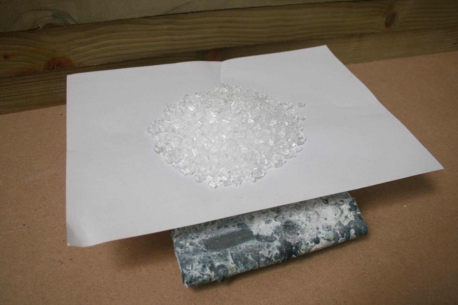
From their London studio, Mukai and Deddens craft each letter by hand using patinated sterling silver tubes connected with clear glass tubes. The striking patina of rainbow colors that characterizes each letter is a consequence of the chemical bath given to the silver components. The final forms call to mind neon signs, with one key exception: instead of emitting light from within, the letters reflect the ambient light of their surroundings.
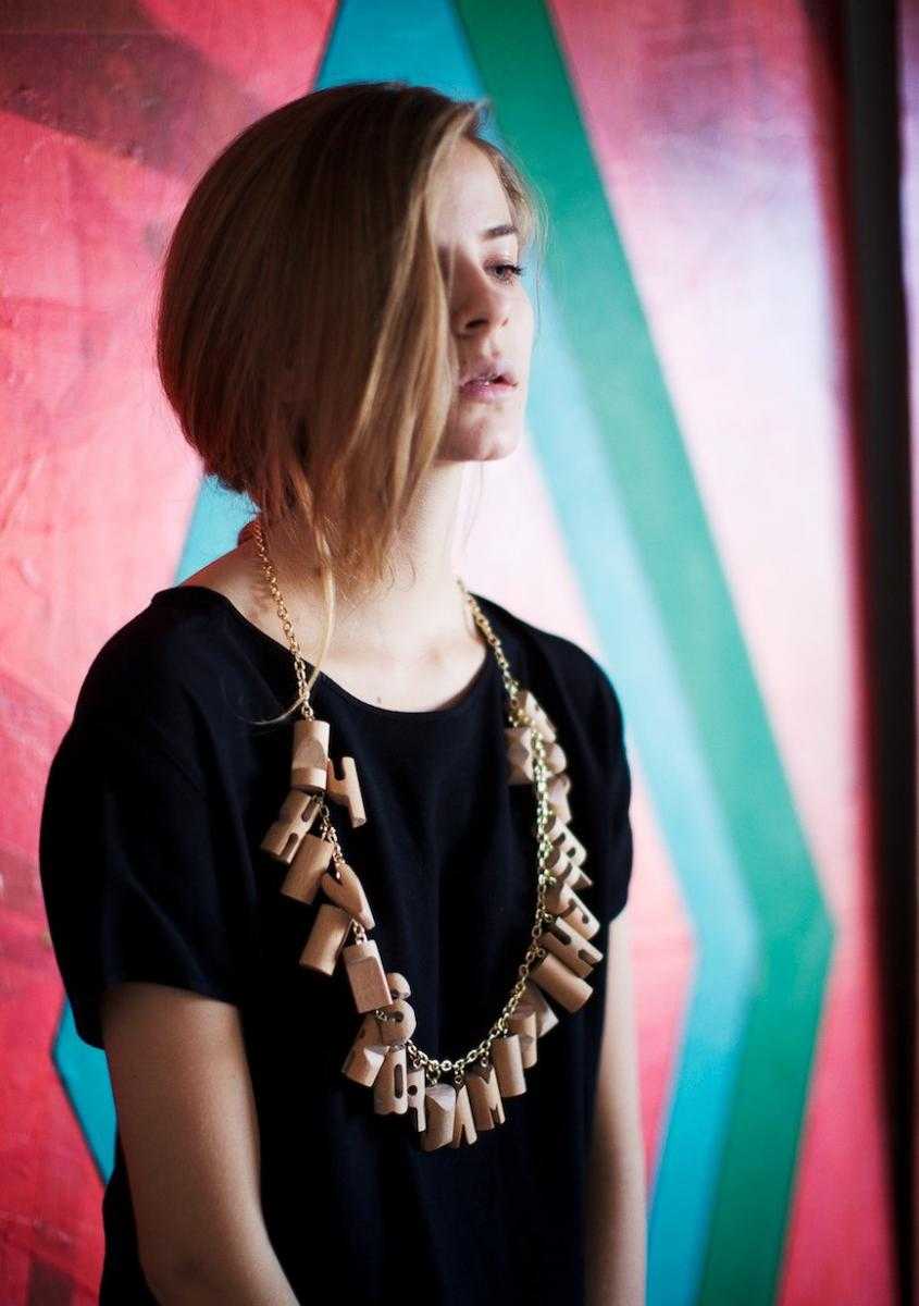
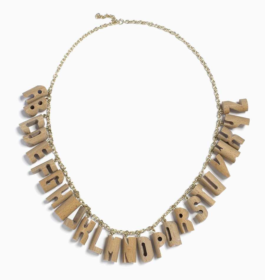
Letter-forms have long been a conceptual catalyst for Mukai and Deddens, who are fueled by self-imposed design constraints. Because experimentation lies at the heart of their practice, opting to work within a formal framework allows them to research a single theme in a variety of iterations. In their ABC Necklace, for instance, produced for Sight Unseen, they created three-dimensional typography-as-jewelry in a range of media – glass, silver, leather, wood, and plastic – but always remained anchored in strict standards of legibility. Mukai explains, “Making alphabets in various materials has been a way for us to isolate the meaning from the message, so we can study what different materials and productions methods communicate on their own.”
Mukai and Deddens met at ArtEZ in Arnhem, The Netherlands, where Mukai studied Fashion Design and Deddens studied 3D Design. Their partnership was established soon after – becoming husband wife in 2007 and then founding their shared studio in 2009. In a few short years, Study O Portable have created a fascinating body of work that resides somewhere between the categories of jewelry, furniture, decoration, and art, and always urges the viewer to look closer and consider what the object is trying to say.
-
Text by
-

Susan Boullier
Susan studied fine and decorative arts at The Courtauld and Christie’s in London and at the École de Louvre in Paris. After years of work on private collections, she co-founded the collectable design consultancy Artecase in Paris.
-